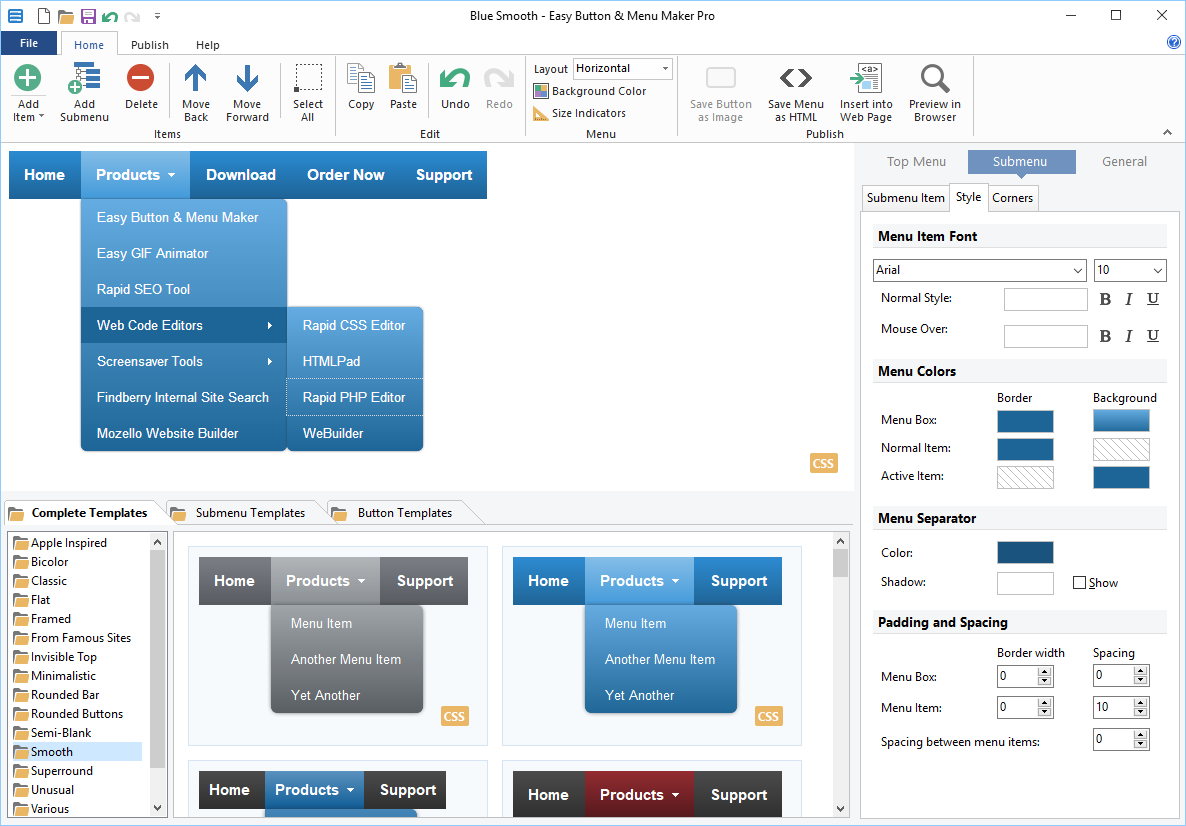
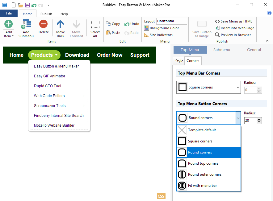
User interface features complete WYSIWYG (What You See Is What You Get) visual menu designer which makes the designing of menus an easy task.
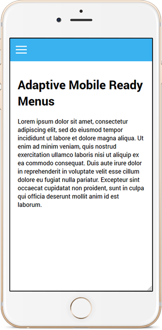
Create adaptive menus that work on tablets and mobile phones.
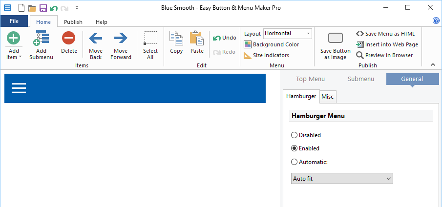
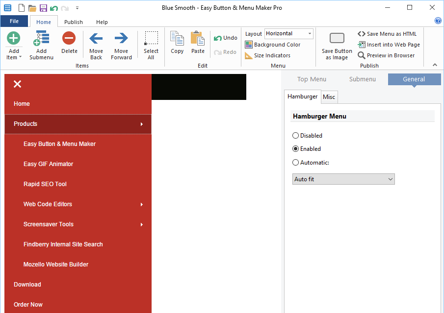
Create compact, minimalist hamburger menus that can adapt to screen size.
Easily create responsive, auto-adapting hamburger-style mobile-ready web menus.
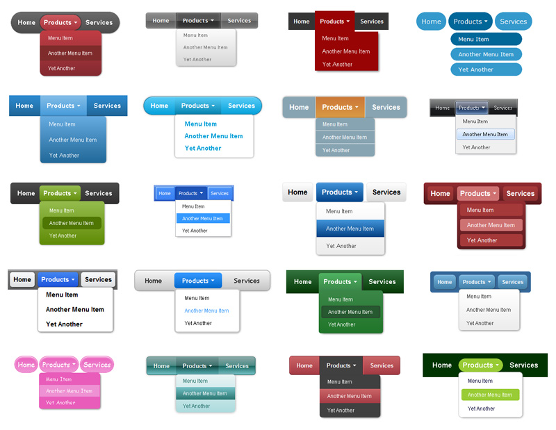
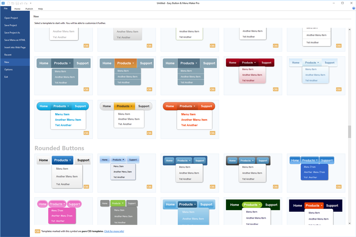
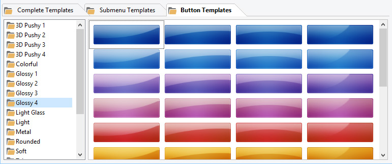
Hundreds of very cool button and menu design templates are included. This image demonstrates just a few samples from hundreds of included and millions of possible combinations.
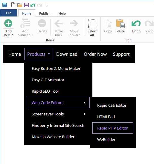
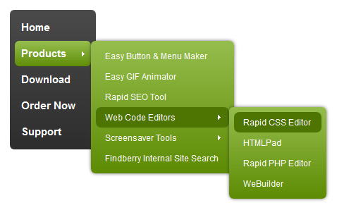
You can create dynamic menus with unlimited number of submenu levels. You can customize any aspect of the menus.
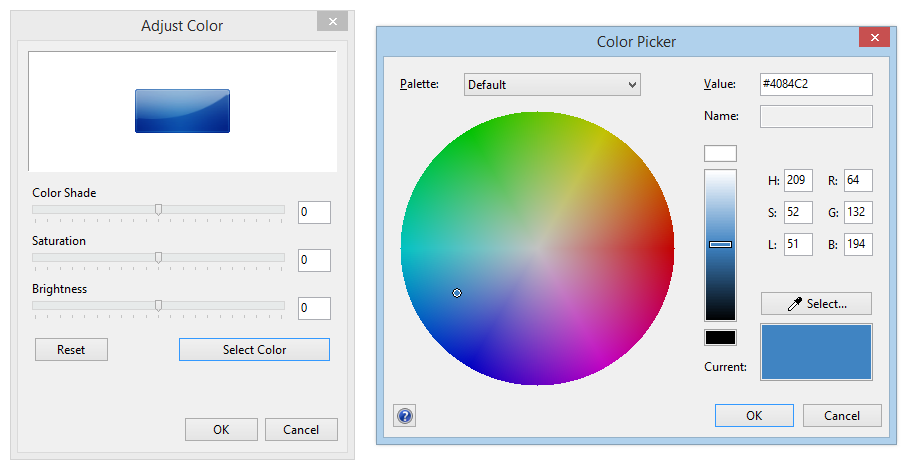
Select from hundreds of button templates. Each button template can be further adjusted and customized to achieve particular brightness or color tone. Note: Screenshot does not reflect the actual button image quality.
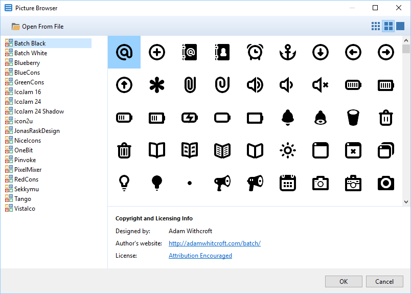
You can easily add icon images to your buttons and menus. Various icon formats are supported. Hundreds of free icons are included.
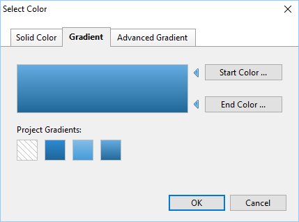
You can fine tune any template or even create your own design from scratch. You can change spacing and padding, colors and corner properties. You can also add various effects.